Patterson Dental Advantage: refresh and relaunch campaign
The Patterson Dental loyalty program (Advantage) was undergoing a renovation and needed an identity refresh and launch campaign. The new logo was based on an upper case A which is also an arrow pointing up (positive movement). The four rows of dots (and four colors) that make up the A represent the four base levels. Gems were used to name the levels because they tested strongest with our sales reps who were in charge of explaining the program and signing up customers.
creative director/designer: Daniel Anderson writer: Jamaal Gilbert
logo
logo lockups and tier icons
brochure for Preferred, Emerald, Sapphire and Diamond tiers
brochure for Diamond Elite and Onyx premium tiers
postcard
mailer envelopes
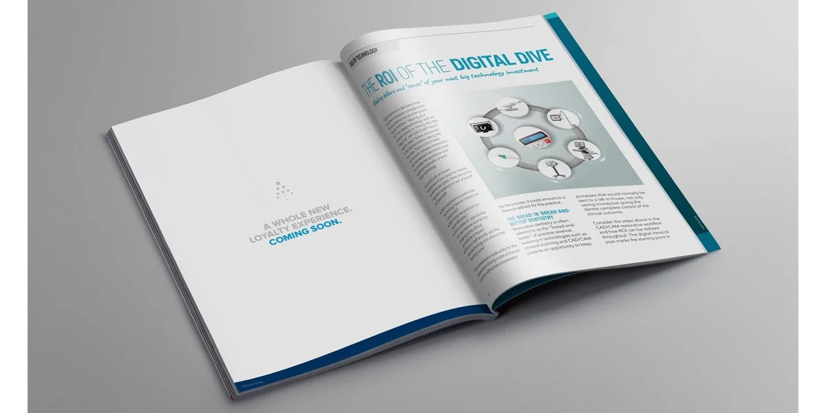
two page print ad


